
Our cover designer takes Corel's latest offering for a spin
When the editor mentioned that he had a copy of Corel Photo-Paint 6 kicking about for review, I was keen to give it a look and immediately put my hand up to take it home and give the tires a bit of a kick.
Why did I want to see this particular product? Having been a user of Corel Draw! since its early versions, I had always been desperately unimpressed with the Photo-Paint application they bundled with it - you didn't really ask for the application, I suspect most
people didn't buy Corel because it had it in there, and those who installed it generally found it ran like a dog and made Windows Paint look almost useful by comparison.
Indeed, the version of Photo-Paint that turned up with Corel 5, while being quite feature-rich, would require an inordinate amount of time to load. When it finally came up - still giving the hard disk a good beating whenever you moved the mouse - would, after
a few rather painful operations on an image file, finally stumble and collapse in a horrible heap of GPF's and Application Errors.
It was with this background in Corel's attempts at bitmap manipulation that I noticed ads in the computer press advertising Corel Photo-Paint 6 as a full stand-alone product - and what's more, 32 bit. Indeed, the blurb on the CD gushes: "The Best in 32-Bit Photo-Editing and Image Creation," which I thought upon reading was a very
big wrap considering my contempt for their previous attempt.
However my curiosity was piqued as I spend a lot of time inside photo-editing packages doing work for traditional publishing (like the covers of this mag) and for Web pages. I had been using Adobe Photoshop religiously for almost a year and while being immensely
impressed with the product, must concede that at almost $1000 I really would want to be. Photo-Paint goes for something around $350. For those who want to get good results, but not to the extent of sacrificing hot dinners for a few months, it seemed that a
Photo-Paint 6 that lived up to even half its claims had to be a good deal.
Installation
My computer seemed to give a visible shiver as I placed the CD into the drive. It had stood by silently, an unwilling but unprotesting participant to the filling of what a month ago had seemed like a vast, unfillable void of gigabytes of free disk space. As it
witnessed the frightening pace of disk usage that is a feature of Windows applications, it secretly rued its foolish complacency.
Using a fairly straightforward installation routine, Photo-Paint happily blundered in and thumped itself down on 69 meg of one of my machine's coveted drives. Had my computer known, it may have tried to convince me to choose the option of running the application off the CD, saving a considerable amount of disk space at the expense of performance. However I had not been feeding the thing new hard disks for nothing and it was forced to live with the somewhat obese new resident, although quietly promising itself to extract spiteful revenge by throwing up an Unrecoverable Application Error next time I tried to print something major without saving first.
Getting Started
The first thing you notice when you run up Photo-Paint - apart from the recently fashionable habit of reciting what it's doing as it launches all its components - are the number of toolbars, sidebars and tool palettes. In a fit of silliness, I decided to see just how many floating toolbars and palettes (or roll-ups) you could hoist (you can probably see by now what calibre of review this is going to be).
After a fury of clicking I came up with a total of 15 - all different shapes and sizes. For a moment there, facing a veritable forest of little boxes covering the screen, it almost seemed that Corel had created a program de-signed to show off all its features simultaneously, but not actually use them.
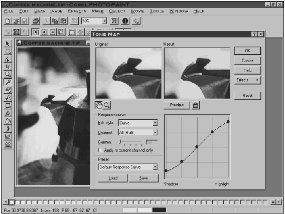
Clearing away this visual junk, I slapped a remotely artistic looking photo of a coffee maker on the scanner and brought it up in Photo-Paint. What I wanted to do was adjust the input/output curve - Corel calls it the Tone Map. After a little hunting I found it, listed under the Effects menu. The Tone Map is a litte like the brightness/contrast control, except you have much more control about what tones you affect.
Figure 2 shows the process of making the darkest parts of the
image a little lighter, and the lightest parts a little darker. This adjustment compensates for the printing press that would otherwise make the original image come out with blown-out highlights and muddy, featureless shadows. The curve also allows me to lighten or darken specific tonal regions in the image without disturbing others.
This routine pre-press procedure highlighted the first drawback of Photo-Paint: its lack of a full-image preview. Adjustments such as lightening midtones have an effect that really cannot be appreciated without seeing the change to the entire image. Photo-Paint only gives you small before and after windows to see the result of changes. You can zoom and shift the pane, but it is difficult to gauge an overall result until you hit OK and commit the change.
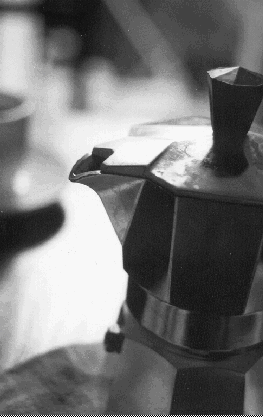
The results of the change can be seen in figure 1, which hopefully
has come out reasonably well. If you're doing a lot of black and white pre-press work involving images like these, it's well worth getting a PostScript printer or alternatively, using a service bureau to output your final copy. PostScript allows the specification
of screening for images which controls how coarse the dots are in an image. Depending on your laser printer and the press you're going to, you may need a coarser or finer dot to get the best results.
That said, I only have a PCL printer, (as does the editor) so the images here don't really do justice to the quality you can get from a 600 dpi laser.
Selecting
The montage is standard fare for graphic designers. To do these mixtures of assorted images two features are vital: good selection tools to allow you to cut out accurately exactly what you want from another image, and effective layer features to allow you to overlap and intermix different images arbitrarily.
Photo-Paint offers a formidable range of selection tools, they are brought out of hiding by clicking and holding on the selection tool icon on the tool bar. After a few moments, the full set of tools flies out allowing individual selection. This feature is famous in Corel products, though it can be a little frustrating to have to wait for the "flyout" when constantly swapping between a drawn selection tool and the "magic wand."The
most useful selection tool, I find, is the aforementioned "magic wand."
For the unfamiliar, this tool selects pixels on the basis of colour similarity. A vital control for this tool is the "similarity" or "range" setting which specifies what range of colours to choose around the colour you clicked on. For instance, set to 1, if you click on a pixel with the value 100 grey (being a black and white image we'll stick to greyscale images) it would select any adjacent pixels which were either 99, 100 or 101 grey.
By judicious use of the range slider, you can build up a selection. Unfortunately, the border pixels between the background and what you want to select are often too similar, you get a kind of "leak" where your selection suddenly explodes out of what you're trying to select. In this situation your fingers are constantly on the control-z keys to immediately undo the fateful action. Note that in many situations, the background is of a more even colour than the subject, so it's common to select the background area (what
you don't want), then invert the selection.
Photo-Paint's magic wand was fine to work with, there a little "+" and "-" buttons to specify whether what you are about to select should be added to or subtracted from the selection you're building up. However, the wand tool did exhibit
annoying behaviour on marginal borders. If I set the range to 0, it would select the current pixel and no more. If I increased the range to 1, it would immediately plunge through the edge, an edge which I could plainly see, but couldn't convince Photo-Paint
to respect.
Once you've more or less selected your subject, you can contract your selection to ensure you're not getting a bit of the background, causing a "haloing" effect when you paste it into a different background. Also if there are little patches of pixels
- often bits of dust from the scanner - which haven't selected, there is a great "remove holes" function which ensures your selection is complete.
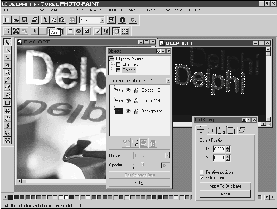
Objects and Layering
To build up your collage, you copy your selection from one image, bring up your destination image and paste the selection as a new object. In older packages, once you pasted in your selection you could slide it about a bit for position, adjust its opacity so it blended a bit better, but once you de-selected, that was it. The selection was nailed to the underlying image never to shift again.
By making your pasted selection an object, Photo-Paint allows you to keep that object (selection, layer - whatever you want to call it) completely independent of the rest of the image. This means you can plonk down multiple images, shift them about, change
their order so one overlaps the other differently, adjust the opacity until the cows come home. Figure 3 shows two objects added to a background image.
The drawback here is that each object takes up more memory, and a file with a number of layers can soon get huge. However, once you're certain about a particlar object, you can merge it to the background image, thus reducing memory use.
The other funky feature with objects is control over how it interacts with the underlying image. You can simply adjust the opacity of the object, so that it become kind of wispy, but more excitingly you can change the "merge mode."
The default mode is normal, but you can change that to add, subtract, multiply, divide, difference, if darker, XOR, saturation and many more. Now, theoretically you can work out what each mode does. Add mode, for example, adds the pixel values of the object to
the pixel value of the underlying image.
However, it's not really important to be able to add, divide or multiply RGB vectors in your head to use these modes. It's more a matter of "touchy-feely" kind of playing about with different settings to get an intuitive feel for what each one
does.
Using the opacity and merge mode controls, you can achieve remarkable results, often as simply as letting a little of the background texture come through overlying text. Other techniques are to overlay multiple copies of the same image with a different merge mode
on each layer.
Filters
If you really want to have some fun, you can't go past filters. Photo-Paint comes with a great range of filters, as well as being able to read in Photoshop filters, of which there are many available free on the Internet.
There are the routine filters, such as sharpen for putting a little sizzle back into scans, anf blur for making realistic shadows or softening up hard edges. These are the vital tools for image manipulation, but also included are a range of really fun and moreover useable filters.
One of the biggest problems with many filters, especially in the Photoshop vein, are the fact that while doing spectacular things, they tend to be useless for actual work as the effect is too crude or obvious. This is more so with the public domain filters. Corel
has succeeded in coding up a range of exiting but subtle filters that produce professional results.
Again, as with the tonal map adjustment, which is found in the same place as all the other filters, the biggest drawback is the postage stamp size preview you get - often quite inadequate to get a good idea of how the overall effect will work. Many effects
look great in areas of solid colour, but look truly bizarre in transition areas.
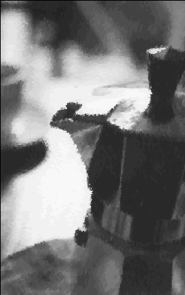
The other thing which I found somewhat overwhelming was the sheer number of adjustments available for the average filter. The artistic Alchemy filter is a good example. It has a zillion different settings available on multiple tabbed pages, allowing you to import your
own patterns, control the density, opacity, variation in stroke pressure, colour, etc., etc., which of course means a fantastic number of permutations, but also means a high level of bamboozlement. Thankfully, the less hairy chested user is saved by the list of
pre-cooked effects. Figure 4 shows the ubiquitous coffee maker
with a simple artistic effect applied.
Almost all filters will only work on 24 bit RGB images, which means any greyscale or indexed (GIF) images have to be converted first - a very simple process, but increases the file size (and thus RAM usage) by three times.
The other factor I found a little annoying was the speed of the filters. When applying the filter, even the most simple effects seemed to take quite a while. There is a progress indicator on the bottom right of the screen, but I found often that it was a little too hard to notice.
A few times I went to save the image just after applying a filter and was confused as to why the Save menu items were greyed. Looking down I noticed that the filter had yet to finish being applied. This ability to do other things simultaneously I attributed to the multi-threaded 32 bit nature of Photo-Paint. I was momentarily tempted to hoist the program onto a dual Pentium machine I had lying about running Windows NT and see whether indeed there were
multiple threads being balanced across the processors, but the deadline for this article loomed so I abstained.
Preparing Images for the Web
An increasingly important feature for any image editing program these days is the ability to save GIF images for World Wide Web pages. As any web user knows, over a 28.8k modem link, which generally runs a something closer to a tenth of that, image size is everything (except for those godless people who turn off images in their browsers).
In Photo-Paint, you first convert your image to Indexed Colour, whereupon you can choose how many colours are to be used in the converted image. For simple images, as few as 8 colours are often sufficient. This makes for a tiny file which will scream across that dribbling wire we call the Internet.
Once converted, you then save the image as a GIF image. Photo-Paint gives you the option of saving in GIF89a format, which then allows you to select one of the image's colours to be transparent.
The other important feature in the GIF saving dialogue is the ability to interlace the image. This gives you the blurry-to-sharp effect, and assists greatly with getting one's whole page up and happening rather than stalling as it hits each image.
Painting
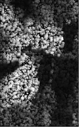
Finally the wet Sunday afternoon features. This is one area where Photo-Paint excels. When you first kick up an image editing program, you have this urge to do something with it. Of course you might load an existing image and apply filters one after another until it becomes an homogenous mush of colour (see figure 5), or you might select the File New option and set out on you own blank canvas. This is real make-or-break stuff for a paint program: can you actually paint with it?
If you went by Windows Paint's definition of a brush, you'd think Picasso used a texta colour for his works (actually, when I think about it, he probably did.) Sure you can draw stuff, but the solid edged lines look nothing like real life.
In the case of Photo-Paint, brushes in a paint program all of a sudden become remotely convincing. The control roll-up contains no less than three different "pages" of options, controlling brush texture, weight, pressure variation, colour variation, edge hardness and many more. This, like the filters dialogues, gives one at first glance a real case of Option Overload.
However, Photo-Paint comes to the rescue with pre-cooked settings. With appropriately exotic names like "heavy cover" and "soft wet oil blend," you immediately have a wide range of brushes to play with.
While this kind of thing is no great achievement in itself, the cool thing is the way they look. Brush strokes can have that real, earthy, grainy look, they can have a random variation in pressure and opacity, much like a real brush.
The result is that even with the most talentless doodle, you get that rather fashionable, rough linen kind of recycled paper kind of "I paint on concrete" kind of effect. Figure 6 shows my effort which took a total of 5 minutes to complete (and looks
like it too I guess).
Oh, those fills...
Another highlight, well known from Corel Draw! 5 and 6, are the fractal fills. These little suckers are a great way to get a visually engaging, high quality background. The most significant feature is that the fills are generated to the resolution of your image,
rather than arbitrarily scaling a pre-made image. This means full detail at any resolution.
By now I was used to the dozens of settings that Photo-Paint likes to throw at you. I guess as you become more familiar with these tools, you move on from the factory presets and start to tweak some of the controls. The most obviously tweakable setting I noticed was the colour settings for the fill. The presets have their default colour, but you could easily pick up theme colours from your composition and set them as the fill colours making for a powerfully linked background.
Conclusion
After playing with Photo-Paint for a while, I overcame many of my initial difficulties with the program. Having used Photoshop so much, you kind of expect all such applications to work the same way. In terms of usability, I found it annoying that Photo-Paint didn't advertise keyboard shortcuts on menu items. Learning even the simplest of these makes work so much faster.
That said, Photo-Paint does allow you to totally customise almost every menu, changing items, separators, icons etc. It also features a formidable scripting language for coding up repetitive tasks. Time constraints prevented me playing with these features, but
in the future I could imagine many uses for such scripts, especially churning out optimised GIF's for web pages.
Speed was also a concern. On my Pentium 133 with 48Mb of RAM, I found Photo-Paint performed reasonably, but wasn't really snappy. When you are going through repeatedly trying different permutations of effects or processes, you really start to notice the pauses and delays as you wait for dialogues to appear or operations to finish.
Reliability wise, I was reasonably impressed, although in one or two cases where I had many images open, Photo-Paint fell into a ungainly heap, citing an Application Error.
Photo-Paint. certainly isn't "The Best in 32-Bit Photo-Editing and Image Creation". I believe Photoshop still holds that crown, not due so much to sheer features, with which Photo-Paint is packed to the gunnels, but more so to the look and feel of the application and the smooth "professionalism" of operation and results.
That said, Photo-Paint 6 represents a leap in quality over Corel's previous offerings. At the price (around $350) it certainly isn't dirt cheap, but does represent very good value. Photo-Paint makes for an eminently usable and creative graphics tool, packed with
good features and capable of high quality output.